Below is a Standard Operating Procedure that explains my process of setting up and launching an email marketing campaign. Using this process, I’ve been able to execute high conversion email campaigns to help my clients. Success is a process, and processes are often repeatable.


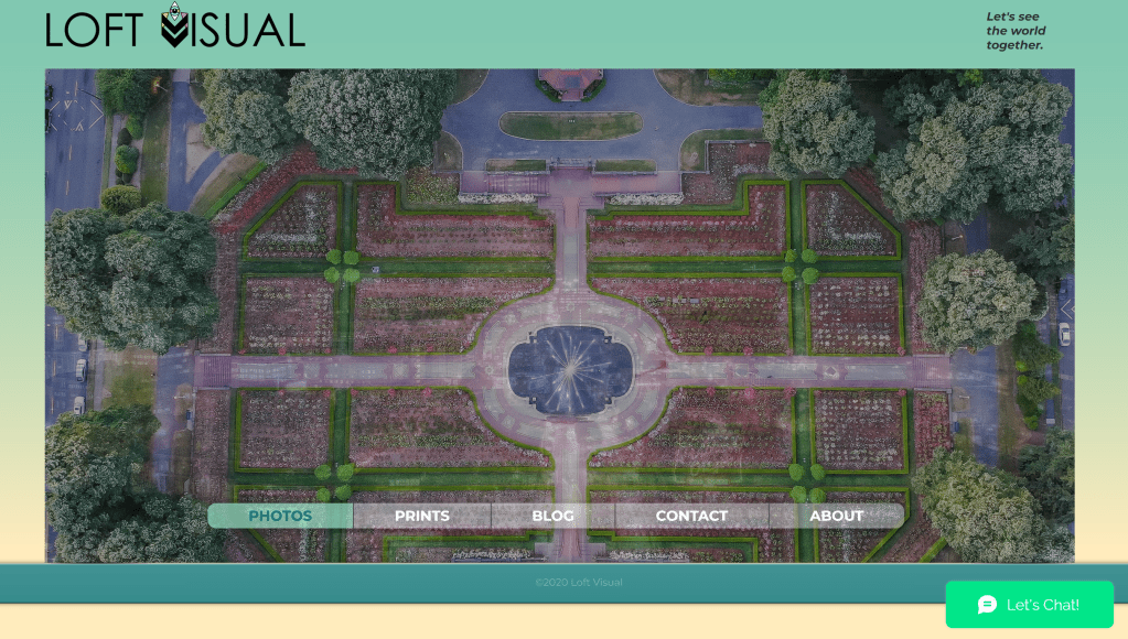
Building a website on the WIX platform to showcase and sell photographs, blog, and connect with a social media audience has been a long-term adventure. I’ve learned about optimization, SEO, and landing page design. My goal was to create a layout that showcases the images at www.loftvisual.com, but also has functionality and is easy to navigate. You can view the Branding Style Guide here.
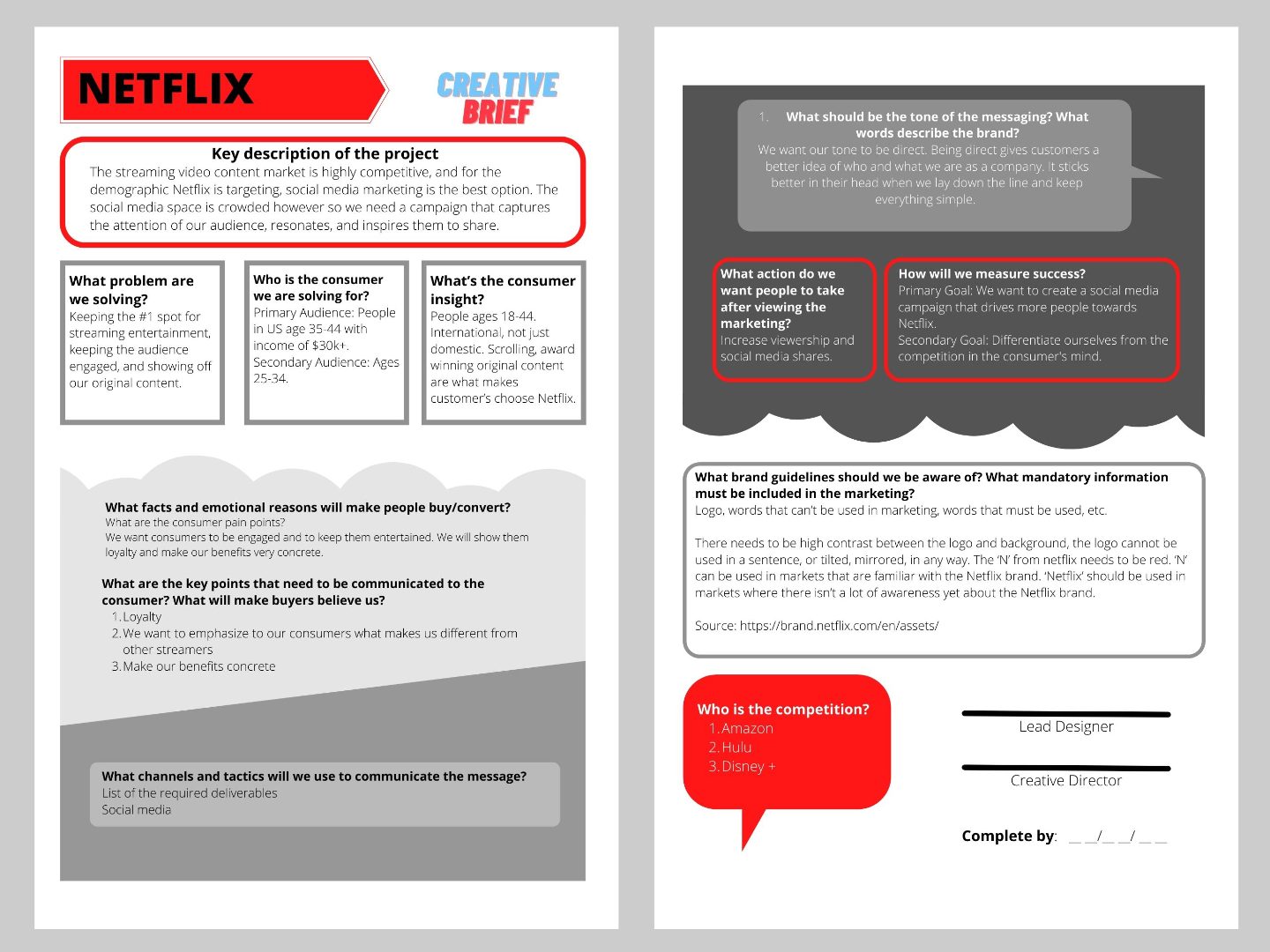
Teamwork: The creative brief below is the result of a team effort by Cece Castillo, Hannah Sullivan, and myself. Each member was tasked with researching a portion of the Goals, Objectives, Strategies, and Tactics. Then I put together our findings in this layout, chose the design elements, and colors that match the Netflix Branding. Our target audience is the CMO and Creative team of Netflix. Our Goal is to express that social media marketing is the best strategy and use of marketing budget for the year. You can reach Cece Castillo on her site http://www.ceceliacastillo.com and Hannah at hannah.s.sullivan@wsu.edu.
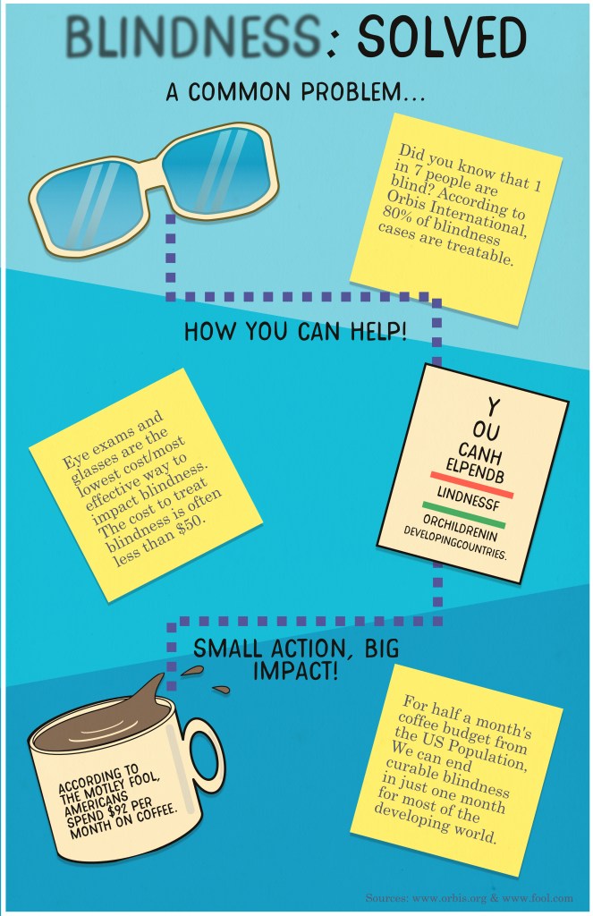
The goal of this poster design is to educate a target audience that blindness is a significant but mostly solvable problem. From a wide explanation of the problem, I used copy and vector illustrations to lead the audience to a specific solution which include a cost that most U.S. citizens could afford to help end poverty related blindness. I wanted the headline to draw attention with the blurriness of the word Blindness, and intrigue the viewer by offering a solution. On the eye exam chart, there is a statement “You can help end blindness for children in developing countries”.
This project was part of a PSA for Washington State University. My goal was to create an analogy to explain the importance of wearing masks during the pandemic. I chose a science fiction movie feel to the poster with readable display font with texture and a hand drawn look. The photo was taken on a digital camera then edited to showcase purple and green – a color combination often used to represent poison, villains (the Joker), and causes a sense of unease.

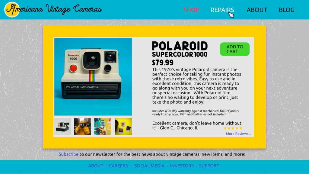
This website layout was designed as part of a challenge to produce a product page with a review, additional photos, and product description. It was made in 30 minutes as part of a timed challenge. I wanted to use colors and type that offer a sense of nostalgia and match the feel of the Polaroid design.
“Bum Wipe Ultra Wipes!”
This print ad was designed as an assignment in Writing 300 class. The professor chose the name of the product and required us to write broadcast copy and produce a print ad and slogan. The design of the ad and the product is supposed to be bold and audacious, yet humorous. The target audience would be fun-loving outdoor enthusiasts who care about natural ingredients.

